|
Flatbed Press |
|
|
by Sean Denmark
There's a somber quietness to Flatbed Press and Galleries. That's partially because the building, on East Martin Luther King, Jr. Blvd., which they just finished renovating last September into an art complex which now includes studios, theater offices, and New Texas Music Works, used to be a massive warehouse. The feeling of quietness also comes from the decor, which is sparse and unadorned. But this quietness is countered with a great sense of energy and production. For ten years, Flatbed has been steadily publishing fine arts prints of high quality with unique style.
Flatbed was founded by two UT professors, Katherine Brimberry and Mark Smith. Jerry Manson of Third Coast Press later became the third owner. The press was created from the print workshop model which has rejuvenated and dominated the American printmaking scene since the 1970s. In this model, master printers provide technical ability and collaborate with an artist whose primary medium is not usually printmaking.
Prints are made by applying paper to an inked plate. There are various ways of keeping the ink in the same place on the plate every time it is printed, thus making the same image on the paper. Flatbed uses intaglio, where ink is wiped into small furrows or holes in the metal plate made by scratching or with acid
There has always been gallery space at the East Austin site, but Flatbed has just recently opened a gallery there which they stock and operate. The exhibition of photographs currently on the walls, though worth a look, cannot compare to their 10-year body of prints. They have concentrated on Texas artists and younger artists of quality while still working with a range of artists, including many non-Texans.
Because their printmaking is all about collaboration, the work is naturally varied depending on the artist, but a certain style appears when viewing the whole of Flatbed's work. Smith said it's a Texas bravura that contributes to Flatbed's style. Brimberry, on the other hand, said that it's their desire for editions that push the envelope, not technically so much as through challenging message or content.
Michael Ray Charles is a good example of an artist who has created challenging work. The paintings of the UT professor draw from stereotypes of blacks from the history of American media to challenge our assumptions of race. His print "White Power" is the slap-in-the-face typical of his work; it's a cartoonish black figure gobbling up a slice of watermelon, with the words "WHITE POWER" boldly written backwards underneath it. In printing this image, Charles and Flatbed have added a beautiful worn and weathered look of an old poster.
Austin's Kelly Fearing has been making prints since he was part of the Fort Worth circle in the 1940s. An ongoing project for him has been to transfer older paintings and prints to plates while changing them. Flatbed published a set of three Fearing prints with bird images that employ his typical gorgeous texture. They're larger than most of his works (Flatbed's prints are often large-but-not-too-large).
It's a sign of the success of their philosophy of collaboration that Flatbed can work with artists ranging in experience from Hancock to Fearing while offering something to each. In each case, no one else could have produced the prints, but they are a step in a different direction for the artist.
From Flatbed's first edition, a suite of prints by Jack Hanley including a black outline of a plague doctor against a mottled red field, to their current projects with Liz Ward with simple, but impossible to identify natural forms, this focus on a single central form can verge on monotonous, and one can get nostalgic for a little old-fashioned perspective.
Another ambitious project for Flatbed is the publishing on their first edition of lithographs. Lithography creates different effects from etching, up until now the only method Flatbed has used. Michael Ray Charles has created a print which fully integrates this different effect. They've started their lithography press with a bang; Charles' work is technically demanding, using layers and layers of color. And as far as artistic vision and sheer gumption goes, I think Charles has topped himself this time.
Looking at ten years of their work, I have no reason to doubt their continued excellence, but this new venture bodes well for Flatbed. |
||
top | this issue | ADA home |
||
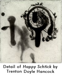 Flatbed is proud to have worked with young Dallas artist Trenton Doyle Hancock, whose star is rising: he was included in this year's Whitney Biennial. I prefer "Happy Schtick" to his painted collages currently on display at the Jones Center for Contemporary Art. "Happy Schtick" combines his Garbage-Pail Kids doodling with more elegant and light-hearted forms that are still uneasy.
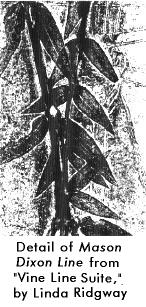 Flatbed often manages to distill the vision of the artist into a single, prominent image. The vision and image needn't be simplistic, as evidenced by their work with Houston sculptor Linda Ridgway this year. Her "Vine Suite" contains three prints of vines, each about 3 inches wide, 8 feet high, and made with a process including pressing real vines into the plate. By focusing on Ridgway's interest in natural forms, the artist's hand has been distilled out of the picture. There is substance to these works in their carefully selected and presented organic images, but Ridgway has greatly removed herself from the process by relying on the vines to make the image. A complicated vision is presented elegantly, but another notable aspect is the ambitious scale, a technical challenge for Flatbed. I admire them for producing a beautiful image even though it might challenge a collector when trying to find a space to hang it.